Research
Secondary Research
In terms of functionality, there are mainly five types of website, these are:
- Brochure - this is basically a digital version of a printed brochure. These website promote companies or products but unlike a eCommerce website - they do not sell these products. The websites are primarily for promoting a business

- eCommerce - an eCommerce website is a way for companies to actively buy or sell products over the internet. The most common areas of an online eCommerce website are: online-retailing, electrical markets and online auctions

- Portal - this website collects information from diverse sources and uniforms them in a specific way to appease a certain audience - usually, the user can choose what information to display. This type of website is used most often in emails, online forums and search engines

- Wiki - a multilingual, web-based, free encyclopedia based on model or openly editable and view-able content

- Social Media - these are platforms that fit in the social media category and can be accessed through apps, online, on mobiles/tablets and on computers. Unlike the other types of website, these ones usually require communication between two or more people instead of someone presenting information to an audience
(What are the different types of websites?,
2019)
What is a Freelancer?
A freelancer is commonly described as someone who is self-employed or will work for a specific employer for short amounts of time - and can also work for multiple at any one time. A freelancer can range in multiple different jobs, not just limited to media related jobs - for example, hairdressing or teaching.
I want to become a freelancer to broaden my horizons when it comes to experience. Working with clients or employers will allow me to gain skills that I can use in the future, while also building my connections.
Analysis of Two Freelancing Websites


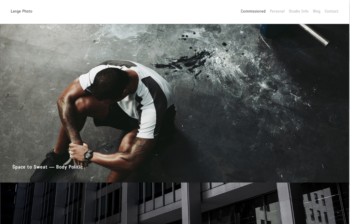
Vincent Laforet is a photographer and a film maker, Laforet and his work have been described as "among the most influential" contemporary to date. Laforet has worked for Apple, CNN, Pepsi Co., Nike and Canon to create stunning adverts through cutting-edge technology that leave people describing them as "inventive, iconic and unforgettable".
Like most websites, Laforet has his name (logo and link to home page) in the top left hand corner of the website, this is the first thing that his audience will see, along with the page names at the top on the same banner as the home button. Unlike Philip Bloom's website, Laforet uses videos on his homepage instead of photographs - I think that this is a very effective choice in the respect that people will be able to see his editing skills off of the bat when looking at his website, but at the same time, this could be ineffective as the person who comes across this website could just ignore these videos and proceed through his website without knowing what Laforet does. Instead of using videos on my home page - besides my showreel, which acts more like a CV - I will have a page dedicated to cinematography and audio.
Laforet's 'about' page is very informative but simple in the sense that it is just a medium length of text and a photograph of himself - this may seem ineffective because of its simplicity, but actually, he goes into an appropriate amount of detail about the jobs that he has done as well as his influence in media.

Laforet has a drop-down menu on his banner that links to separate pages that display projects - such as Project Air, a project in which he took aerial/ sky-line view photography of well-known cities - that he has taken part in or directed. Another aspect on his banner that I like is that his name, which is in the top left corner, links back to the home page. I will definitely be using this aspect on my own website.
The majority of his website is photography, which is interesting to look at, but there is not much writing on it. I like the idea of having a tutorials page on my website as that means that I will be able to potentially teach my audience skills as well as displaying to my audience what aspects of media I have skills in.
UPDATE: I have decided to get rid of my tutorials page as I have come to the realisation that the website that I am trying to present to my audience is not one of learning but instead a website that potential clients and employers can look at and speak to me through - my website is more about experience than learning and that means I no longer need the tutorial page. This makes my website a little more like Laforet's as I also do not have as much writing, much like his website. The only page that will be used to add updating text, is the Portfolio page - this is where I will be able to tell my audience about the experiences I have, but not to teach them new skills. So far on my portfolio page, I have my photo albums and also my interaction with WorldSkills UK Live.


Philip Bloom is a director of photography, a director and a filmmaker. From the first image that you can see on his website, it is clear that he is professional and tries to target both people who want to find out about he work and contact him and people who want to learn about his adventures and skills (through his blog). An aspect that I like from his website is that you can clearly see his name, even though it is over a photo, you can still see it. Similarly, I also like the titles that he has used under his name to describe himself (director of photography, director and filmmaker).
Aspects I would like to use in my website after looking into Philip Bloom's is the use of the footer. Bloom uses this as a way to link all of his appropriate social media's so that his audience can find him on all platforms that he uses and discover more about his media endeavours. This will be useful for me to use as that means that I will also, potentially, gain audiences from all of these social medias and not just necessarily people who stumble across my website online.
Unlike Laforet's website, Bloom has much more writing - he goes into a lot of detail about his work that can be informative to his audience and his potential clients as they can see the level of detail that his has gone in. Another thing that Bloom does - which I was going to do but later decided against - he has a Workshops & Tuition page where he can be hired to help his audience learn specifics about media.
Wix Templates
These are all the appropriate photography templates I could find that already keep the black and white style that I want on my website. As well as this, I want the front page to display photographs or information describing my business so that my audience is immediately attracted to the site and will feel compelled to look around it.

This one is called Street Life, it has a nice, clear, banner which has the logo/ owners name in the top left corner - followed by the page buttons underneath it, this makes the banner easy to navigate as well as allowing the audience to chose a page that displays what information they want to see. At the bottom of the page, in the footer, the website has linked their social media handles by using small images with a link that opens another tab. I will be using this idea on my website as well as I have information and other interesting things that my clients and audience might like to see, these are things that I feel shouldn't be on my website and this is the main reason for linking them.

Photography Forum is another template that I liked in the beginning because it had all the asspects that I was picturing my website to have. For example, and similar to the Street Life template, there is a simple banner at the top of the page and a big, main, photograph that covers almost, if not all, of the home page. Unlike the Street life template however, the Forum has the logo in the centre of the banner, the social media handles on the top right hand side of the banner instead of in the footer of the page and the pages are in the top left hand corner instead of under the logo. Furthermore, another aspect that I liked in the Forum, is the use of a chat page - which is the small, orange rectangle in the bottom right of the page. When you scroll, the box moves with the bottom of the tab so that it is always visible; when it is clicked on, the chat room opens and the audience is able to send a message to the creator or admins of the page - which the owners, creators or admins can then reply to. I would like to use this aspect on my own website so that viewers can get in touch with me, however, I would like to change the rectangle to a small, grey, speech bubble instead - as this will not directly distract my audience unless they are specifically searching for a button that allows them to talk to me.
(The Place to Create Professional Websites, 2006)
(The Place to Create Professional Websites, 2006)
Chosen Template

This is the template that is also known as the 'storyteller CV'. I am going to be using this as my template for Wix partly because when I look at this moment in time when I haven't edited it (Elijah Louis' website) it looks like a professional, well put-together and creative website. As well as this, I am able to use each section with a different colour and subject which allows me to express the black, white and grey style that the audience from my survey said that they like most.
It also applied to all of my needs, for example, my logo in the top left corner, pages on the same banner but in the top right corner. All the information is included in segments in the middle so that it is easy for my audience to locate any information that they want to see. At the bottom of each page is the links to my social medias, this is so that is my audience wants to see anything else which is not on my website they can, as well as being able to get in touch with me is the need to.
I think that this template will be the most successful for the website that I want as it looks sophisticated and professional - and since I am only a college student without much experience, this website will definitely give me an extra boast when my clients come to look at it.
Squarespace
Squarespace is similar to Wix as it offers templates to the user and has a simplistic production process that aims to cause as little confusion to its users as possible.
 This is the first template has a very nice look to it, it is simple but displays an appropriate amount of information so that the audience know what they are looking at. Much like most websites, the pages are in the top right-hand corner of the screen, I keep seeing this layout throughout the templates and official websites that I have analysed. Because of this fact, I will be using this layout in my own website as I feel that it is the most effective.

This second one is really similar to the first one I picked out, except it is a lot darker and is pretty much just white text on black backgrounds. Except, this one has coloured images that stand out a lot more as the background is not multiple colours and does not take away from the subject. Although this is a nice template and has the same layout of banners and information, I will not be using this because I was hoping to find a template that allows me to have lighter grey gradients so that my images are easier to see.
After looking at the templates that squarespace provides, I feel that using one of these templates will be too simple and look unprofessional. Due to this, I will not be using squarespace as a potential software to make my website. I will not be using this site. Instead, I will use either Wix or MUSE to make my website as I am confident that they will allow me to make my website the best it can be. (Squarespace, 2003)
Mood Board


Originally, I felt that this black and white mood board related perfectly to my website, however, after exploring more with the aspects of my website and the photos that I have included, I feel that these other photos also apply to my website.


Primary Research
Questionnaire:
- How often do you use websites that display secondary information in a week?
- From these examples, which colour combination do you think works best together? (choices given on paper copy)
- Why?
- What interests you most about websites?
- What annoys you most about websites?
- Why do you use websites?
- What social media do you use? (choices given on paper copy)
- What type of photography do you like? (choices given on paper copy)
Results:
- 83% of the audience that answered my survey are 18 or under
- 50% of my audience is female and 33.33% are male (the rest wish not to specify)
- 33% said that they use websites every day and another 33% said that they use websites a few times a few
- 50% of people said that black and white colours work best on a website because they like the "mix of light and dark" colours and they love the "contrast"
- The majority of my audience agrees that advertisements on websites (such as pop ups) are the most annoying thing about websites
- The majority of my audience said that they use websites to learn/ expand their knowledge on subjects and skills
- Snapchat and YouTube are the most common social media apps that my audience use, but Instagram and Pinterest are also two that are commonly used by my audience
- 66% of my audience likes portrait photography, 66% like landscape photography, 66% like wildlife photography and 50% like urban photography
Evaluation:
My questionnaire results are helpful to me as it allows me to determine what my audience likes when they visit websites, as long as facts about photography and social media. As well as this, I am able to see that the majority of the people that answered this questionnaire on Survey Monkey (meaning that they answered it on their own will, so my results aren't forced) are female and the majority of these people think that black, white and grey work best together on a website because they like the "mix of light and dark" and the "contrast" that these colours create.
Target Audience
As I am making a website for media related products, I am saying that my audience is males, that are aged between 15-30. My target audience has a large range of ages because the majority of freelancers are between this age as they are trying to gain appropriate experience to join larger businesses.
Age: 15-30
Gender: Male
Country/ City: King's Lynn (as I am also English and living in King's Lynn, I feel that this is my most likely audience)
Job/Income: They could have a range of income as they are all clients with specific needs and wants, they could have a range of jobs as they could require an editor, photographer or cinematographer for multiple reasons whilst also needing an employer - not just a freelancer
Ethnicity: White British/ Black British
Race: White, Black, Asian (anything really)
However, from the results that I got from my questionnaire, I have more of a female audience that are 18 or under (although, there was apparently a person who was 65+).
There are over 49,000 people living in King's Lynn (as of 2017, this is the most recent research done on the city population website). There are 24,155 males and 24,845 females living in King's Lynn at the time of this census - which perfectly matches the research I gathered from my questionnaire as more of my audience was female. Roughly, about 18,829 people are aged between 15-30 years old in King's Lynn.


These charts give me a rough idea of the ethnicity, race and place of birth of my target audience. From these I know that the majority of people who live in King's Lynn are from the UK, are White and are either Christian or of no religion. (East of England, King's
Lynn, 2018)
Socio Economic Group
 From the research that I did into my target audience, I can deduce that my audience's socio economic group's are between C1 and C2. I think that this is the most appropriate for most cases of clients as they will be turning to a freelance worker for help with media - which means that they are willing to pay to low prices that I charge for working. However, there is also potential clients that may be looking to employ me as well, in this case, then they will most likely be in the B group - and by a stretch, perhaps even in the A group.
Blumler & Katz' Uses and Gratifications Theory
What is the Gratifications Theory?Blumler & Katz' suggests that all media users play an "active role" in using and choosing media. What this means is, the audience is able to pick and choose what type of media they consume and they can control the amount of content they see and what information they want to get from articles, movies, stories, feeds and other media related products on and off-line. This theory also covers that the audience seeks out products that fulfil these needs:
- Information and/or Education: the audience can gain education and knowledge from online products, as well as constant information from programmes such as BBC News and Documentaries
- Entertainment: consumers watch programmes and read articles for entertainment and enjoyment
- Personal Identity: viewers can relate, identify with and like products and role models through media and will often go as far as creating similar values, mimicking and copying characteristics
- Social Interaction: media products create topics of conversation between groups of people, can be linked to personal identity as social interaction through people can change the way they act
- Escapism: media products create an escape from the users everyday life, computer games and action films let viewers escape and imagine what could be classed as "a better world"
How does this apply to my project?
According to Blumler & Katz' Uses and Gratifications Theory, my product will appeal to my target audience's needs because it can educate people how to make a professional looking website while also teaching them about freelance. My product will create social interaction when my audience ask me questions or talk to others about my site, I also have allowed comments on my Facebook page where individuals can communicate between each other in the comment sections of my posts. People who visit my website can personally identify with my website as they too could be freelancers or be looking for freelance work/workers. Overall, my website provides multiple aspects that can fulfil my audiences needs, this further provides evidence to me that my website will be successful.
User Flow
User Flow - a prototypical user on a site. For example:
- the user starts on the homepage
- from the homepage they click on one of the pages at the top
- the page button will send them to a new page with the content I want to display on it
- from here, the user can look at the information and interact with whatever aspects they want to
- if they click on a aspect that send them to a sub page then they will be shown more information related to the subject
- they can click other pages and go to these pages
- and they can click my name in the top left corner and go back to the main home page
- icons at the bottom of the pages that link social medias will send them to the selected social media by creating a new tab instead of redirecting them from my website
Commonly made for actors, artists and presenters, a show-reel showcases the work the individual has done in the form of a short promotional video. This video can be used as a CV or a Resume and are about 3-5 minutes long. As well as this, a showreel can be used to "gain representation from an agent or at least secure an initial interview." (What is a Showreel?)
This showreel was created to promote a singer's music and videos. This is a good example of a showreel because it follows a lot of what showreels are. For example it is 3-5 minutes long, the song does not have many lyrics to it so it doesn't deter the audiences attention, the scenes and actions in this showreel appear to happen in time with the music - which makes the song and visual seem more captivating and complicated.
I like the use of scenic shots - like trees and sunsets - that have been used in this showreel because one of my most favourite types of photography, establishing shots and art work is scenic shots. As a result of this, I will be using these shot types and scenic genre in my showreel as it will present to my audience the things that I am interested in while simultaneously showing my experience in cinematography and location awareness.
Planning my Showreel
When planning my showreel I came across the idea that I should add music to the background - this would keep my audience interested as it will not be purely cinematography. I decided to have a look at music that is primarily just audio and not vocals as music with vocals will distract my audience to be more interested in the lyrics than the visuals and I do not want that to happen. As well as this, I am creating a showreel, not a music video.
This is the music that I have chosen to add in the background - granted, on my website you can not hear the music, but I have uploaded it to YouTube and people will be able to access it there.
I am going to be using this music as it is upbeat but not particularly distracting. The drum makes the video seem energetic and holds a steady beat throughout - which could symbolise that I will keep my work consistent throughout the clients experience with me. This music was not made by me, however, in the description there is a purchase licence that sends you to a website - on this website I was able to download a free preview that I could use in my showreel.
Irving Penn


Irving Penn is well known for his photography and printmaking, Penn was an "intensely private man who avoided the limelight and pursued his work with quiet and relentless dedication." (Garza, 2017)
Penn mainly worked with Vogue magazines, where he provided photographs for the haute couture collections in 1950. These photo's mainly consisted of portraits in black and white, which I think is a good link to my website as I was aiming for a dominantly monochrome website.

"No matter what people tell you, words and ideas can change the world." - Robin Williams
This is my favourite black and white photo that Penn has done, it is of Robin Williams - a famous actor and fantastic voice actor, who committed suicide in August 2014. It is my favourite because it makes me remember the movies that Williams has been in and how much of an inspiration his is to people - especially people in media related businesses.
I would like to implement Penn's style of portraits into my website one day as it will show my audience the experience that I have in photography - as well as being able to show emotion, diversity and meaning through people. At the moment, however, I have not added these types of photos at the moment as I feel that I do not have the skills to patiently capture this style of photo just yet - I would like to wait until I have my own camera that I fully know my way around so that the photos are the best they can be.
Short Evaluation of Research
I believe that my research has greatly impacted my idea as a the beginning of the project I had just planned on making a freelance website where I can teach my audience about the skills and experience I had; they could potentially learn from it or become inspired in some way. Now, however, my website is less of a place to learn about subjects and more a place to inform clients about me.
My research into my target audience has allowed to create specific areas of interest for certain people. For example, older clients who are looking for a freelance worker can contact me to discuss their business, all the information they need can be found on the 'about' page or they can you the instant messaging app that I have added. People who are looking for photography can look on my 'portfolio' page at a specific genre of photography (such as portraits) or go on to my 'about' page and look at the prices that I offer for freelance work.
My research into my target audience has allowed to create specific areas of interest for certain people. For example, older clients who are looking for a freelance worker can contact me to discuss their business, all the information they need can be found on the 'about' page or they can you the instant messaging app that I have added. People who are looking for photography can look on my 'portfolio' page at a specific genre of photography (such as portraits) or go on to my 'about' page and look at the prices that I offer for freelance work.
Good start to your research Holly, you’ve conducted research into the types of websites and looked at two examples relevant to your idea. I feel your analysis of these two can be expanded on, for example, what type of things they put on social media? What images do they use for background?
ReplyDeleteThen when you choose a Wix template, explain why you think it’s the best design from the research you have conduct into other websites.
You’ll also need to finish your section on your target audience.
Your research has developed since i last looked, you have conducted a survey to gauge the interests of your audience. I'd like to see how this information has helped your idea? what does know knowing the age, gender and race do to develop your work?
DeleteSince there is a substation amount of research here, you may want to consider writing a concluding paragraph where you summarise all your findings and explain how that has directly influenced your project.
Your research is effective, particularly where you outline aspects from other websites you would like to include in your own as it shows how your research is developing your idea. You have also documented how your idea has progressed by updating your mood board and deciding on the programme you will use to make your website.
ReplyDeleteMaybe explore the psychographics of your target audience further (things like hobbies and interests). It could also be useful to clarify how your questionnaire has helped to develop your idea - whether it has affected what you will include in your website.
You've done some very detailed secondary research, highlighting types of websites and using your primary research to determine the target audience. To improve on this part of the project, you could write a short paragraph concluding all the information you've gathered and further explain how you'll use this when creating your own production.
ReplyDelete